


Type design developed from the 4th to the 5th semester in the ESPM design course guided by Professor Luciano Cardinalli.
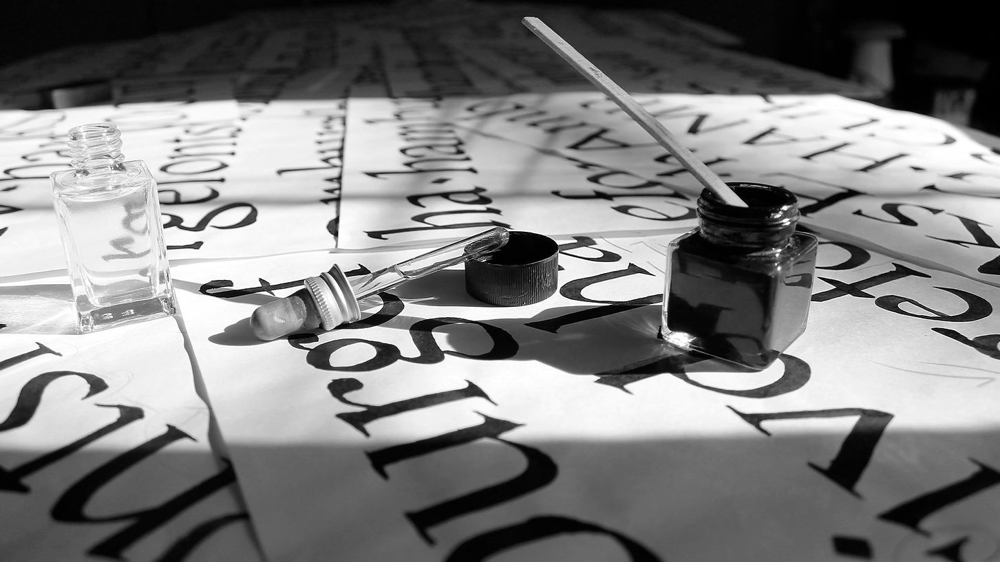
As far as typographic design is concerned, this is the longest job I've ever worked on, supervised by Professor Luciano Cardinalli, we start with a whole semester of calligraphic studies, in order to define and find our typography, with each new study we decide whether it is serifed or not, whether the contrast is large, medium or moderate.
In these decision-making processes, in the end I arrived at Cangapé. A Roman bicameral typeface, designed for long text patches of normal weight of subtly semi-expanded proportion and medium x medium height


thinking about a better reading experience, I also designed a series of ligatures that, with the use of OTF fonts, make the text block more congruent in terms of its density, thus improving the affordance of legibility and readability.


With stems ending in serifs inspired by the Baroque transitional type, they are bilateral and symmetrical, curved drop-shaped ends contrast with slanted and pointed ends.

ABCDEFGHIJKLMNOPQRSTUVWXYZ
abcdefghijklmnopqrstuvwxyz
àáäãâçèéëêïîñ
öõôúûüý
àáäãâçèéëêìíïîñ
òóöõôúûüý
0123456789
(“!?”.,;:@&/\-_°|)
ABCDEFGHIJKLMNOPQRSTUVWXYZ
abcdefghijklmnopqrstuvwxyz
àáäãâçèéëêïîñ
öõôúûüý
àáäãâçèéëêìíïîñ
òóöõôúûüý
0123456789
(“!?”.,;:@&/\-_°|)

more projects!


